Feed It Forward
This food bank, formerly known as Adams County Emergency Food Bank wanted to stimulate it's community to rally around helping those less fortunate in their area. They came to us because they needed to create an incentive for surrounding businesses and residents to want to partner with them to help feed the hungry. After several meetings, we realized that their DMV type look was not exciting to potential partners. We then pitched an idea to them: to completely re-invent their image, and to start anew, as a brand that excites.
Old Logo
Their old logo was a boring clipart image. It does not excite, and it also plays into the "government organization" stigma that we needed to break out from.
New Logo
The new logo incorporates the revitalized feel. The woman's face is ambiguous to race or creed and her head is tilted upward to signify strength and pride. Overall, the goal was to make the logo pretty and modern so members of the community would be proud to wear it on their person or items.
Media Strategy
Our team was blown away when we first stepped foot in Feed It Forward food bank. The level of efficiency and kindness was overwhelming. Our job was simple: just show who they are and what they do.
Separate Categories that Show Who They Are
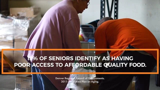
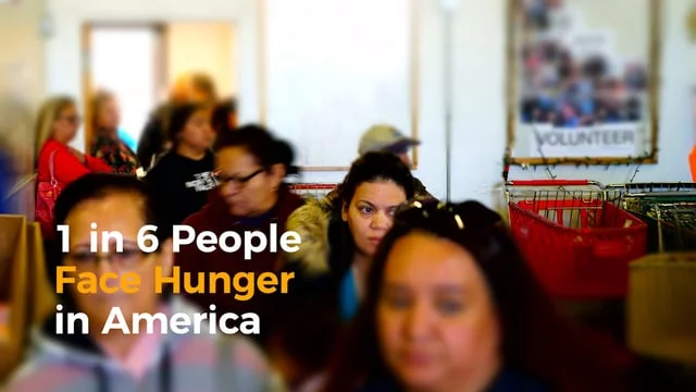
Each set of videos is strategically created to emphasize one key aspect of what Feed It Forward does and who they are.


